


Teze Bazar

Teze Bazar
Client
Teze Bazar
Year
2022
Services
Брендинг
Веб-дизайн
Разработка
Recognition
Awwwards
Siteinspire
Təzə Bazar, the oldest market in Azerbaijan, has planned a large-scale reconstruction by 2024. While architects are shaping the future outlook of the fair in the center of Baku, our team focused on building a cohesive visual identity, including development of the new website.
Striving to capture the essence of Təzə Bazar – its rich history, vibrant atmosphere, and diverse offerings – we were inspired by the architecture of the building and traditional Azerbaijani crafts. Our main challenge was to create a flexible design system that allows others to interpret, develop, and expand the style we've created for the market's virtual image.
.webp)
The Logo
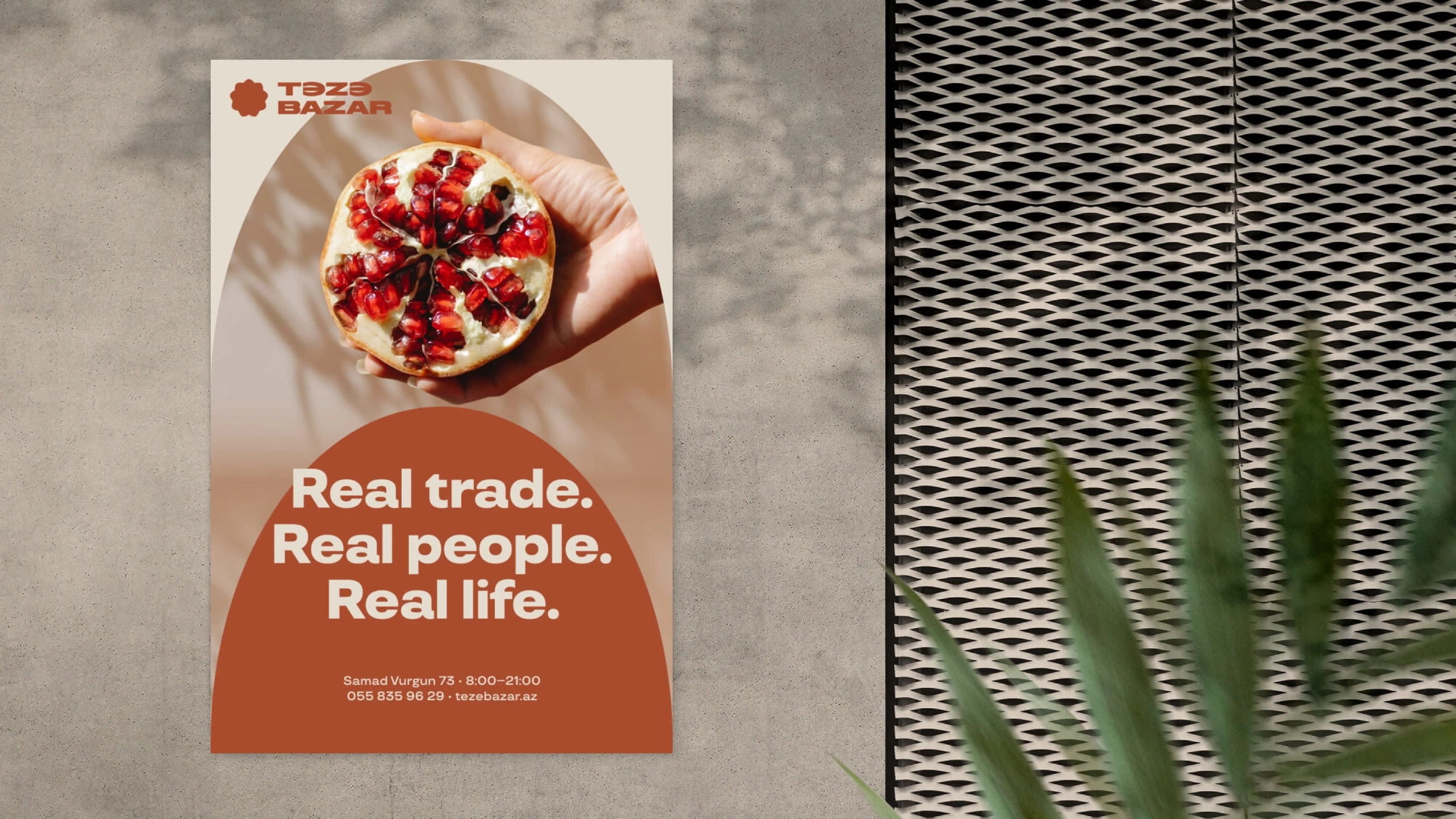
We based the logo on the characteristic arches of the market building and shaped them like sun or flower. This design combines the imagery of sunny Azerbaijan, fertile soil, and abundant harvest. Sunrise also resembles the patterns of the iconic Karabakh carpets known as "Chelabi" or "Sunburst" in English.
The typography of the logo represents a modern reinterpretation of the bold grotesque fonts commonly used in local markets in the 80s. The accent letter "Ə" was carefully crafted to easily transform into the letter "E" in other languages.


We have created a vibrant color style, featuring diverse color combinations that capture the spirit of the market’s variety – from fruits and flowers to easily recognizable oriental architectural forms.
The TT Travels font was chosen as the main. We complemented it with the wide strokes of the logo and customized it specifically for the Azerbaijani language, incorporating unique characters and handwriting elements.

A market is like a miniature city – it should be convenient for people of different ages and social statuses. Together with the Təzə Bazar team, we focused on creating an identity that is understandable to all generations, yet not conservative or neutral. We added liveliness, charismatic icons, and skillfully blended traditional patterns with modern aesthetics.
Another delicate and unique aspect of the new style is a series of ornaments. We simplified elements from traditional Azerbaijani carpets and textile designs and used them to maintain a cohesive modern style throughout all design elements.

Icons
There are numerous departments that require organization in the market. Therefore, we created two sets of icons. The first one is dedicated to categories of goods represented at the Təzə Bazar. They all have their own character – slightly whimsical and with a touch of individuality. We drew inspiration from marketplace navigation of the past to convey its warmth and nostalgic charm.


The second set of icons is related to navigation. They are simple, modern, clear, and self-sufficient. Guests of the Təzə Bazar will easily find important technical and public spaces with their help.
However, the market is not just about complex navigation but also a structure with many components that require branding. We worked on all its parts to ensure that the buyer experiences a unified visual system, no matter where they go or what they engage in at the bazaar.


Merchandise
We carefully designed the market's merchandise – shopper bags, braided baskets, t-shirts, badges made upon the icons, and many other things. Visitors feel a deeper connection and a sense of community, taking a piece of their favorite place with them. That’s why our goal was to create stylish products that will be a fit for both Baku residents’ outfits and their home interiors, extending the values of Təzə Bazar beyond its location.


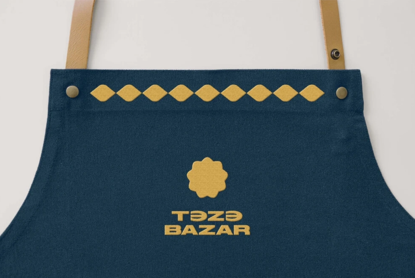


The market employees will wear uniforms inspired by traditional Azerbaijani robes, adorned with the sun logo and incorporating colors from the Təzə Bazar's branding palette, offering a variety of color combinations.
Website
While the market is undergoing reconstruction, the website plays an important role as a central hub for all its news and events. As the foundation for the website, we utilize one of the key visual elements of the future market – its arches. In our design, the arches function like windows that can be filled with anything, conveying various new meanings.


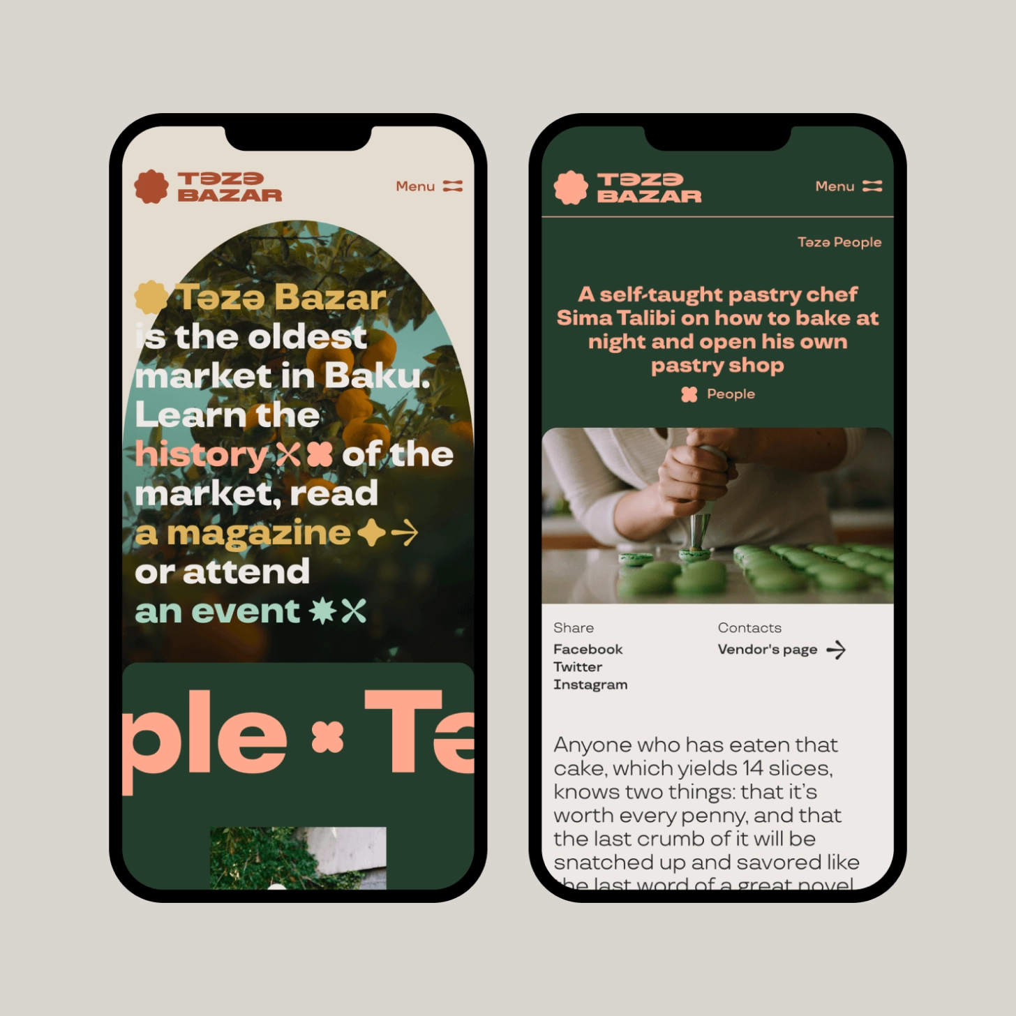
The website has three main sections. In Təzə People, a magazine section, cards have changing forms inspired by ornaments and highlight the unique features of the market's vendors. The Residents section is a straightforward list of vendors. The last one, News and Events, has two feeds with distinct card designs for news and upcoming events. The website makes it easy for visitors to browse and find the information they need, while also being visually engaging and reinforcing the overall aesthetic of the new identity.

Website live
Credits
Анастасия
Дизайн Директор, Основательница
Саша
Дизайн Директор, Основатель
Александр
CEO, Основатель
Ирина
Дизайнер
Daria Tishchenko
Designer
Medina Gilmanova
Animations

